
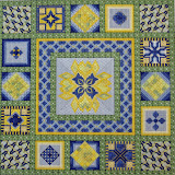
When choosing colors for your piece, here are a few things to consider:
- Complementary colors on the color wheel instensify each other. For example, yellow and purple are opposite each other. Purple will seem more intense when next to yellow, and vice versa.
- Dark colors receed, bright colors come forward. To create the feel of distance, use muddier colors for the background, clearer colors for the foreground.
- A touch of a "dead" color (dark grey, brown, etc.) makes work more realistic.
- Colors tend to darken when stitched.
- Try to repeat each color in a piece at least once unless you want the color to stand out.
- Some designers say every piece needs a touch of black. Others say every piece needs a touch of purple. Still others think every piece needs a touch of yellow.
- Black may be too intense, especially if used alone. Consider using a very dark brown instead.
Subscribe to:
Post Comments (Atom)


No comments:
Post a Comment